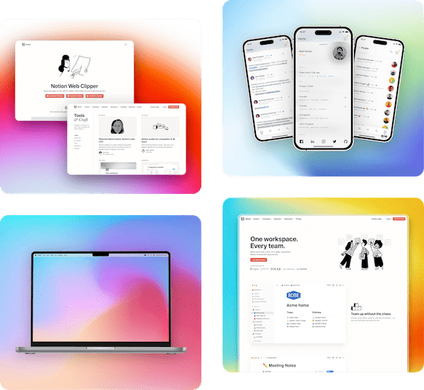
Pika has a color picker in almost every template. Backgrounds, text, frames, shadows, the browser bar. Over the years I've tried most of the React color pickers on npm to power them, and these three are the ones worth installing.
They're good at different things, so this isn't a ranking from best to worst. It's which one I'd pick for which job. Download counts are weekly numbers from npm at the time of writing, and sizes are what each picker adds to your bundle (built with esbuild, minified, gzipped, React left out).
Quick comparison
| Colorshot | react-colorful | react-best-gradient-color-picker | |
|---|---|---|---|
| npm package | @orshot/colorshot | react-colorful | react-best-gradient-color-picker |
| Weekly downloads | n/a | 7.26 million | 72,260 |
| Maintenance | Active | Active | No recent releases |
| Gzipped size | 34.4 KB JS + 7.7 KB CSS | 3.5 KB | 69.9 KB |
| Gradients | Linear, radial, conic | No | Linear, radial |
| Value in and out | Any CSS color or gradient string | Hex, RGB, HSL, HSV (strings or objects) | rgba() or gradient string |
| Vue | Yes, same package | No (React and Preact) | No |
| License | MIT | MIT | MIT |
1. Colorshot
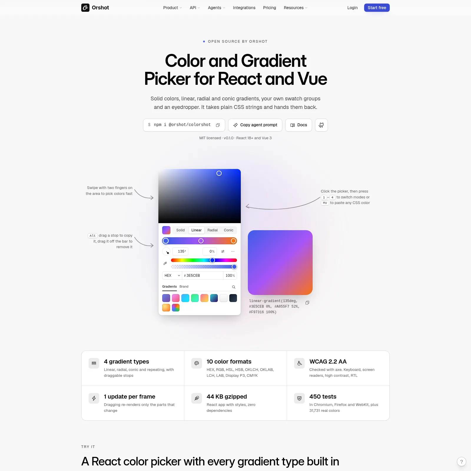
Colorshot is the React color picker I wrote for Pika and Orshot. It handles solid colors and linear, radial and conic gradients in one picker, and it only reads and writes plain CSS strings. You pass it linear-gradient(135deg, #3E5CEB, #22C55E) and you get the same kind of string back, ready to drop into a style prop or save to a database.
npm i @orshot/colorshot
"use client";

import { useState } from "react";
import { ColorPicker } from "@orshot/colorshot/react";
import "@orshot/colorshot/styles.css";

export function FillPicker() {
  const [fill, setFill] = useState("linear-gradient(135deg, #3E5CEB, #22C55E)");
  return (
    <ColorPicker
      value={fill}
      onChange={setFill} // every frame while dragging
      onChangeComplete={(value) => save(value)} // once, when the drag ends
    />
  );
}
A few things I needed for Pika that it does out of the box:
- Every CSS color format. Hex, RGB, HSL, OKLCH and Display P3 all work as input, and
outputFormatcontrols what comes back. Pika keeps hex so old saved presets still load. - Gradient stops you can use with a keyboard. Each stop is tabbable, Enter adds a new one and Delete removes it. The picker uses proper slider, radio and tab roles for screen readers, and it supports RTL and Windows high contrast (forced-colors) mode.
- An eyedropper through the browser's EyeDropper API, swatch groups with recent colors, and an optional WCAG contrast badge for text colors.
- Safe values. Text it can't read is shown as unsupported instead of being passed through, and
isSafeCssValue()lets you check a stored value before writing it into HTML or CSS.
It's one package for React and Vue. @orshot/colorshot/react and @orshot/colorshot/vue are separate entries, so a React app never bundles the Vue code, and the core helpers (parseColor, formatColor, contrastRatio and friends) have no framework at all and run on the server.
Where you'll see it: every color picker in Pika runs on Colorshot today, including the custom gradient backgrounds in the screenshot editor. Orshot Studio uses it too. Pika loads it the first time you open a picker, so pages that never show one don't pay for it.
The trade-off: it's slightly heavier than a solid-only picker, about 34 KB of JavaScript and 7.7 KB of CSS gzipped for the full React picker. For the features and control you get, that's a fair price, and it's held up well in Pika.
The docs, a live demo of every prop and copy-paste setups are on the Colorshot page linked above, and the source is on GitHub.
2. react-colorful
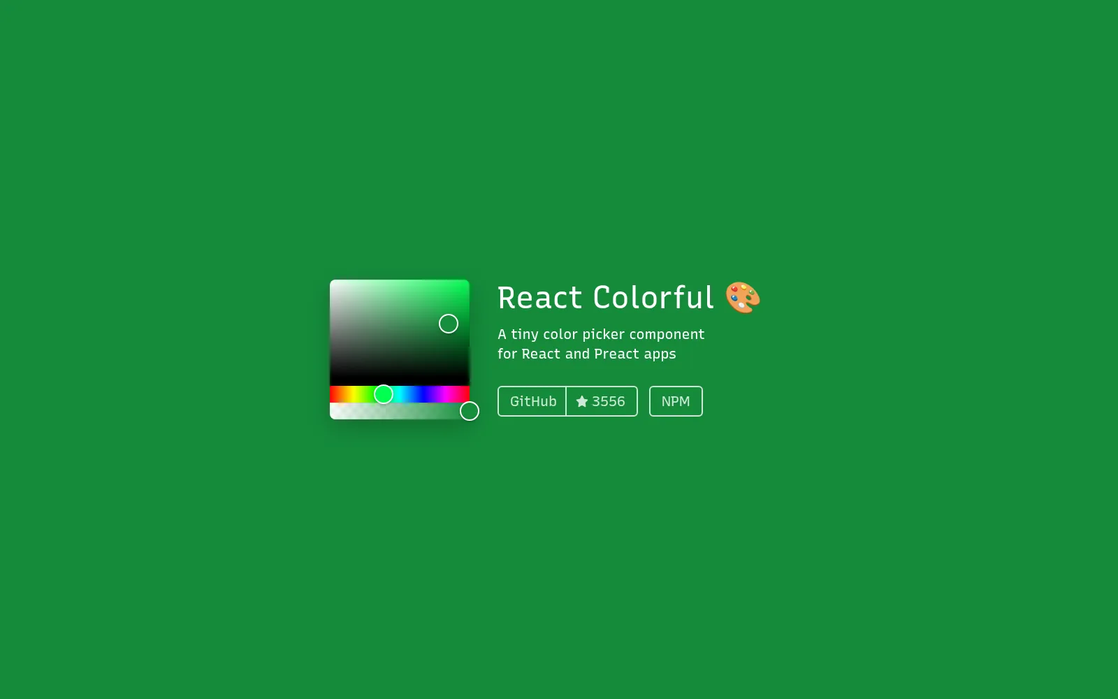
react-colorful by Vlad Shilov is the default pick for a reason. It's tiny (the HexColorPicker measured 3.5 KB gzipped), has no dependencies, is written in TypeScript with full test coverage, and follows WAI-ARIA so the saturation area and hue slider work with a keyboard and screen readers. At 7.26 million downloads a week it's by far the most used picker on this list, and it's still actively maintained.
import { useState } from "react";
import { HexColorPicker, HexColorInput } from "react-colorful";

export function BrandColor() {
  const [color, setColor] = useState("#3E5CEB");
  return (
    <>
      <HexColorPicker color={color} onChange={setColor} />
      <HexColorInput color={color} onChange={setColor} prefixed />
    </>
  );
}
It ships a picker per color model (hex, RGB, HSL, HSV, with and without alpha) so you only import the one you use. It doesn't do gradients, format menus or an eyedropper, and it doesn't try to. You build the rest of the UI around it.
Pick it when you need a solid color and care about every kilobyte. A theme color setting, a tag color, a single brand color field. For that job it's still the best choice and I'd use it over Colorshot.
3. react-best-gradient-color-picker
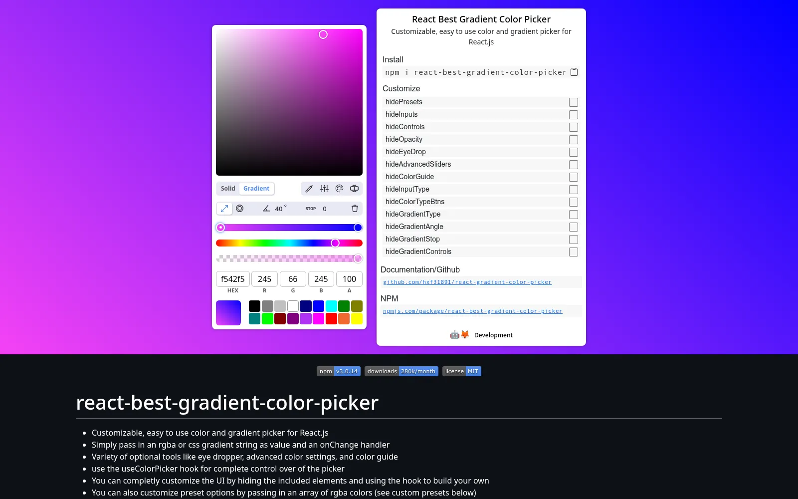
If you want a full gradient editor in React and don't want to build one, react-best-gradient-color-picker has been the go-to for a few years. You pass in an rgba() color or a CSS gradient string, and you get one back.
import { useState } from "react";
import ColorPicker from "react-best-gradient-color-picker";

export function Background() {
  const [color, setColor] = useState("linear-gradient(90deg, rgba(62,92,235,1) 0%, rgba(34,197,94,1) 100%)");
  return <ColorPicker value={color} onChange={setColor} />;
}
It comes with a lot in the box: solid and gradient modes, linear and radial gradients, presets, extra sliders for saturation, lightness and brightness, and a color guide that suggests pairings. The useColorPicker hook lets you drive it from your own buttons, and nearly every part of the UI can be hidden with a hide* prop. Its eyedropper uses the EyeDropper API where the browser has it and falls back to html2canvas where it doesn't, so it also works in Safari and Firefox.
Keep in mind: it doesn't support conic gradients, and it hasn't had a release in a while. It's also the largest of the three at 69.9 KB gzipped, and about 47 KB of that is html2canvas, bundled for the eyedropper fallback. If you need the eyedropper everywhere and only work with linear and radial gradients, that can be a fair trade.
What about react-color?
react-color still gets 2.42 million downloads a week, but it hasn't had a release in years. For a new project I'd go with one of the three above. If you like its picker styles, @uiw/react-color has most of them (Sketch, Chrome, GitHub, Compact, Circle, Block, Material and a few more), is actively maintained and lets you install one style at a time. @uiw/react-color-sketch on its own is 7.1 KB gzipped.
Adding a color picker to shadcn/ui
shadcn/ui doesn't ship a color picker, so most projects put one inside a Popover and style it with the theme tokens. Two easy routes:
With react-colorful, use your existing Popover and Input:
import { HexColorPicker } from "react-colorful";
import { Popover, PopoverContent, PopoverTrigger } from "@/components/ui/popover";
import { Input } from "@/components/ui/input";

export function ColorInput({ value, onChange }) {
  return (
    <Popover>
      <PopoverTrigger asChild>
        <button className="h-9 w-9 rounded-md border" style={{ background: value }} />
      </PopoverTrigger>
      <PopoverContent className="w-auto space-y-3">
        <HexColorPicker color={value} onChange={onChange} />
        <Input value={value} onChange={(e) => onChange(e.target.value)} />
      </PopoverContent>
    </Popover>
  );
}
With Colorshot, ColorField already is a swatch that opens the picker in a popover (it stays on screen, closes on Escape and returns focus). Map the theme tokens once in your global CSS and it matches the rest of your components:
[data-colorshot],
[data-colorshot-field] {
  --cs-accent: var(--primary);
  --cs-bg: var(--popover);
  --cs-fg: var(--popover-foreground);
  --cs-border: var(--border);
  --cs-radius: var(--radius);
}
import { ColorField } from "@orshot/colorshot/react";

<ColorField label="Background" value={background} onChange={setBackground} />;
On older shadcn/ui themes that store tokens as bare HSL numbers, wrap each one in hsl().
Which one should you use?
- A single solid color, smallest bundle: react-colorful.
- Gradients (including conic), any CSS color format, or React and Vue from one package: Colorshot.
- A full gradient UI with an eyedropper that works in every browser, and only linear or radial gradients: react-best-gradient-color-picker.
- The look of react-color without the unmaintained package: @uiw/react-color.
If you want to see Colorshot in a real app first, open any template in Pika and click a color. That's it.
![5+ Best screenshot API [2026]](https://assets.pika.style/cdn/blog/best-screenshot-api/cover.jpg)